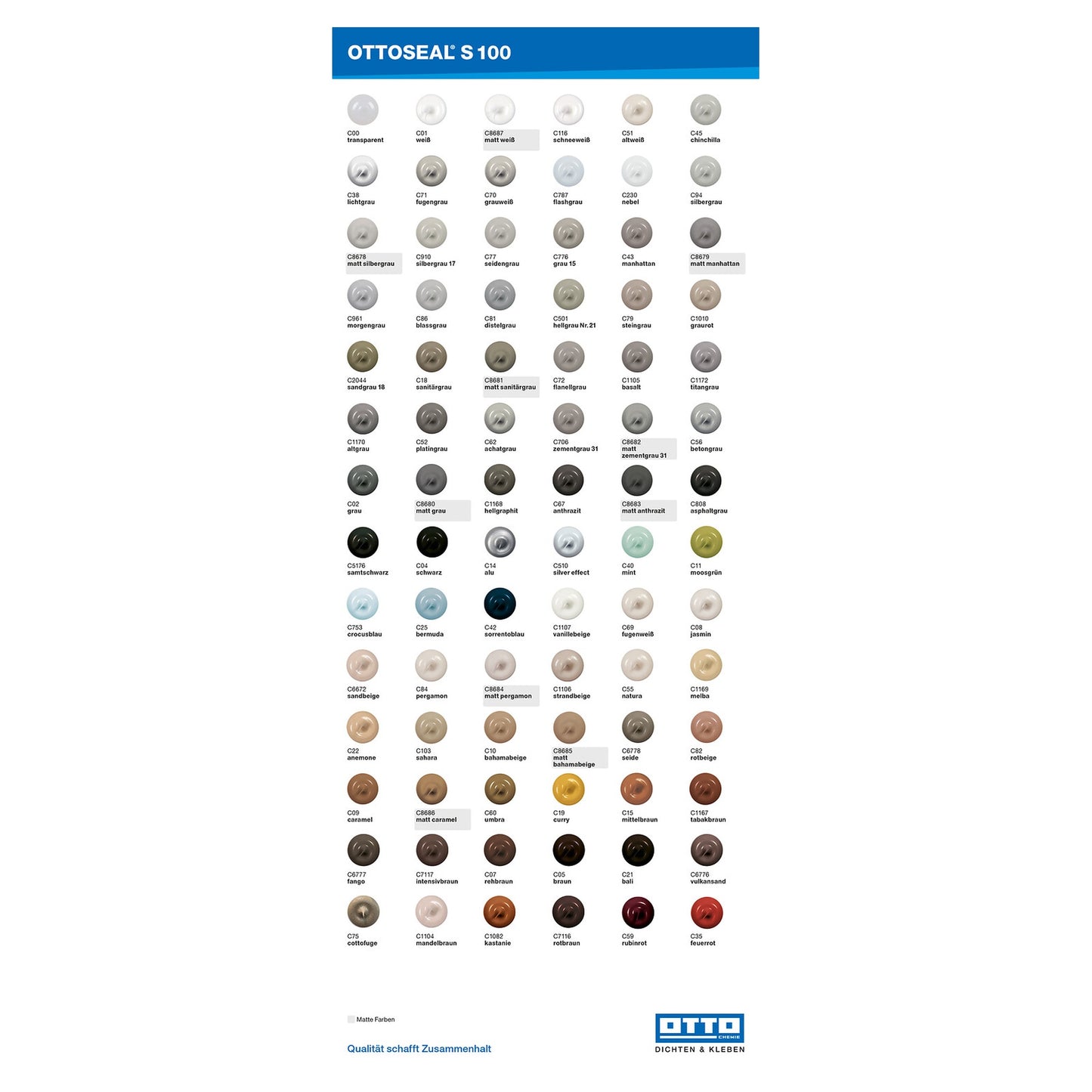


OTTOSEAL® S 100 Verarbeiter-Farbtafel
OTTOSEAL® S 100 Verarbeiter-Farbtafel
Out of stock
Herstellerinformationen
OTTO Chemie
Hermann Otto GmbH
Krankenhausstr. 14
D – 83413 Fridolfing
info@otto-chemie.de
Couldn't load pickup availability
OTTOSEAL® S 100 Verarbeiter-Farbtafel – handliches Farbmuster für Profis
Die OTTOSEAL® S 100 Verarbeiter-Farbtafel ist das kompakte Farbmuster für alle, die Farbtöne schnell, präzise und direkt am Objekt beurteilen möchten. Durch das handliche Format lässt sich die Farbtafel besonders gut an Fliesen, Natursteinoptiken, Sanitärkeramik oder Wandanschlüsse anhalten – ideal für Baustelle, Kundentermine und die schnelle Abstimmung vor Ort.
Wofür ist die Verarbeiter-Farbtafel gedacht?
Schnelle Farbfreigabe am Untergrund
Ob Neubau, Renovierung oder Nachbesserung: Die finale Farbwirkung einer Fuge entsteht immer im Zusammenspiel mit Licht, Struktur und Umgebung. Mit der Verarbeiter-Farbtafel prüfst du die OTTOSEAL® S 100 Farbtöne direkt dort, wo sie wirken sollen – ohne Interpretationsspielraum durch Monitorfarben oder unpassende Produktfotos.
Perfekt für Handwerk, Objekt & Beratung
- Verarbeiter: schnelle Bemusterung, klare Farbentscheidung, weniger Reklamationen
- Bauleitung/Planung: zügige Abstimmung mit Kunden und Gewerken
- Service/Fugen-Sanierung: passende Nuance zu vorhandenen Fugen leichter finden
Vorteile der handlichen Verarbeiter-Farbtafel
Kompakt, robust, praxisnah
- Handliches Format für den direkten Vergleich an schwer zugänglichen Stellen
- Schneller Farbcheck bei wechselnden Lichtverhältnissen (Badlicht/Tageslicht)
- Effizient im Ablauf: weniger Fehlbestellungen, weniger Nacharbeit
- Professionelle Bemusterung beim Kunden – auch unterwegs
Mehr Sicherheit als reine Farbansicht online
Fliesenoberflächen, Fugenbreite, Glanzgrad und Raumlicht beeinflussen, wie ein Ton wahrgenommen wird. Ein physisches Farbmuster macht diese Unterschiede sichtbar, bevor Material verarbeitet wird.
Typische Anwendungsfälle
- Farbton-Abgleich in Bad, Dusche, WC und Küche
- Bemusterung an Fliesen, Keramik, Glas und angrenzenden Oberflächen
- Objektarbeiten: einheitliche Farbwahl über mehrere Räume/Wohneinheiten
- Reparatur/Service: nahezu passender Ton zu bestehenden Fugen bestimmen
So nutzt du die Verarbeiter-Farbtafel für die beste Farbentscheidung
Praxis-Tipps für realistische Farbwirkung
- Farbtafel direkt an den Untergrund halten (nicht aus der Entfernung beurteilen).
- Immer bei Tageslicht und bei künstlichem Licht prüfen.
- Farbwirkung aus typischem Betrachtungsabstand (ca. 1–2 m) einschätzen.
- Bei kritischen Tönen: kurz an mehreren Stellen testen (Wand, Boden, Nischen).
Hinweis: Je nach Umgebung kann derselbe Farbton unterschiedlich wirken. Die Verarbeiter-Farbtafel ist dafür gemacht, die Entscheidung am realen Einsatzort abzusichern.
Passend dazu: OTTOSEAL® S 100 Sanitär-Silikon
Sobald der Farbton feststeht, kannst du das passende OTTOSEAL® S 100 Sanitär-Silikon gezielt auswählen und bestellen. Weitere Verarbeiter-Farbtafeln für andere Produkte (z. B. S 70, M 360) sind ideal, um dein Bemusterungs-Set zu komplettieren.
Häufige Fragen (FAQ)
Was ist der Unterschied zur Standard-Farbkarte?
Die Verarbeiter-Farbtafel ist besonders handlich und für den schnellen Vergleich am Untergrund ausgelegt. Dadurch lässt sie sich in der Praxis oft einfacher anhalten und beurteilen – gerade bei Ecken, Nischen oder schmalen Bereichen.
Ist die Farbtafel für Innen- und Außenprojekte geeignet?
Die Farbtafel dient der Farbwahl für OTTOSEAL® S 100. Für die Beurteilung empfiehlt es sich, den Ton an der jeweiligen Einsatzstelle und unter den relevanten Lichtverhältnissen zu prüfen – innen wie außen.
Kann ich damit vorhandene Fugen nachstellen?
Ja. Gerade bei Reparaturen hilft die Verarbeiter-Farbtafel, den nächstliegenden Farbton zu finden. Halte die Tafel an die bestehende Fuge und vergleiche bei Tageslicht sowie im Raumlicht.
Warum wirken Farbtöne je nach Raum anders?
Lichttemperatur, Fliesenstruktur, Glanzgrade und umliegende Farben beeinflussen die Wahrnehmung. Ein physisches Farbmuster ist deshalb deutlich verlässlicher als eine digitale Darstellung.
Markenhinweis
Markenprodukt der Hermann Otto GmbH.